Overview
Datorama's Media Cost Center is a tool that automates analysis of what your media is doing versus what you planned. It dynamically associates advertising data with your media plan and calculates costs so that you are always on top of how and where your dollars are spent.
Datorama's Media Cost Center allows integrating media buying information into your Datorama account.
Once the data is added to your account, Datorama will do all the complicated calculations for the defined date ranges, according to the specified cost type and given rate, considering parameters like monthly budget, booked units and margins. This financial information is stored as IOs in Datorama and uses the data which comes from the various delivery systems to recalculate the actual media cost.
Currently, many Datorama users don’t use the Media Cost Center because it’s too complicated and users don’t understand how to use it or what is the added value.
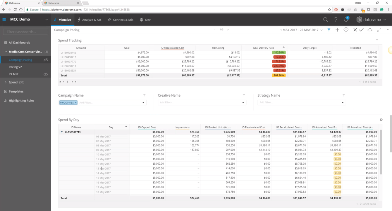
Datorama's Media Cost Center Current Design:
My Role
My role was to design the app, collaborating and working closely with the product manager. Together we defined our new app:
MCC App Goals:
1. Promote MCC sales by providing a clearer idea of the product’s added value
2. Introduce a new and innovative visualization for the planning vs. actual pacing use case
3. Building additional offering based on the existing feature
Who are the users?
Media buyers, ad operations working for Brands, Agencies or Publishers.
When? Following the buying, during the monitoring and optimization phase of the campaign’s run.
App Elements:
Monitoring:
• Overall stats
• Sorted list of IOs that are: under pacing, pacing risk, on track and over pacing
Optimization:
• IO Drill Down - Why is an IO underperforming
• What’s the effect of the outstanding issue
• Suggested actions
Reporting:
• Extracting summary reports
• Set slack notifications
• Share outstanding issues using email
• Documenting causes and actions taken as “IO notes” on charts
Schedule:
The monitoring and the optimization are planned for version 1 and the reporting will be added for version 2.
The MCC Design
After understanding what the app should do, focus on, and who are the users I started the design process.
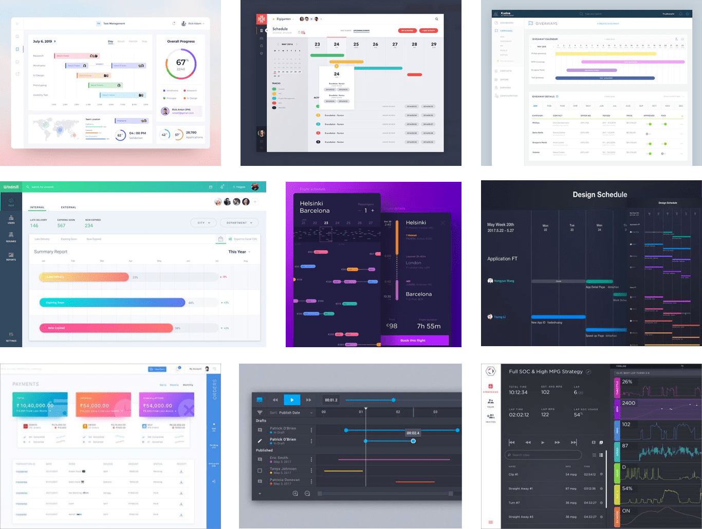
The main obstacle was to understand how to organize all the data in a simple and innovative way. I had an idea of placing the campaigns on a timeline and sorting them by color for a clearer view. I wanted the user to have a colorful, fun and easy experience. The first stage for me was to get inspired, some of my inspirations:
My next step was to start designing the App, only as wireframes, trying to figure out what will be the best UX practice for the app.
Wireframes
One of the first UX design included:
1. Gantt view for all live IOs
2. Analysis of the user main interest points
3. Filters for easy access to the information the user is interested in.
4. Search for existing items to match a specific IO
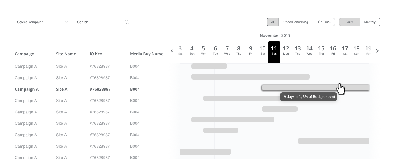
Gantt view for all live IOs - Monthly view:
Hover - How am I spending / pacing overall?
When clicking - Drilldown of a specific IO’s planned vs. actuals analysis and suggested actions
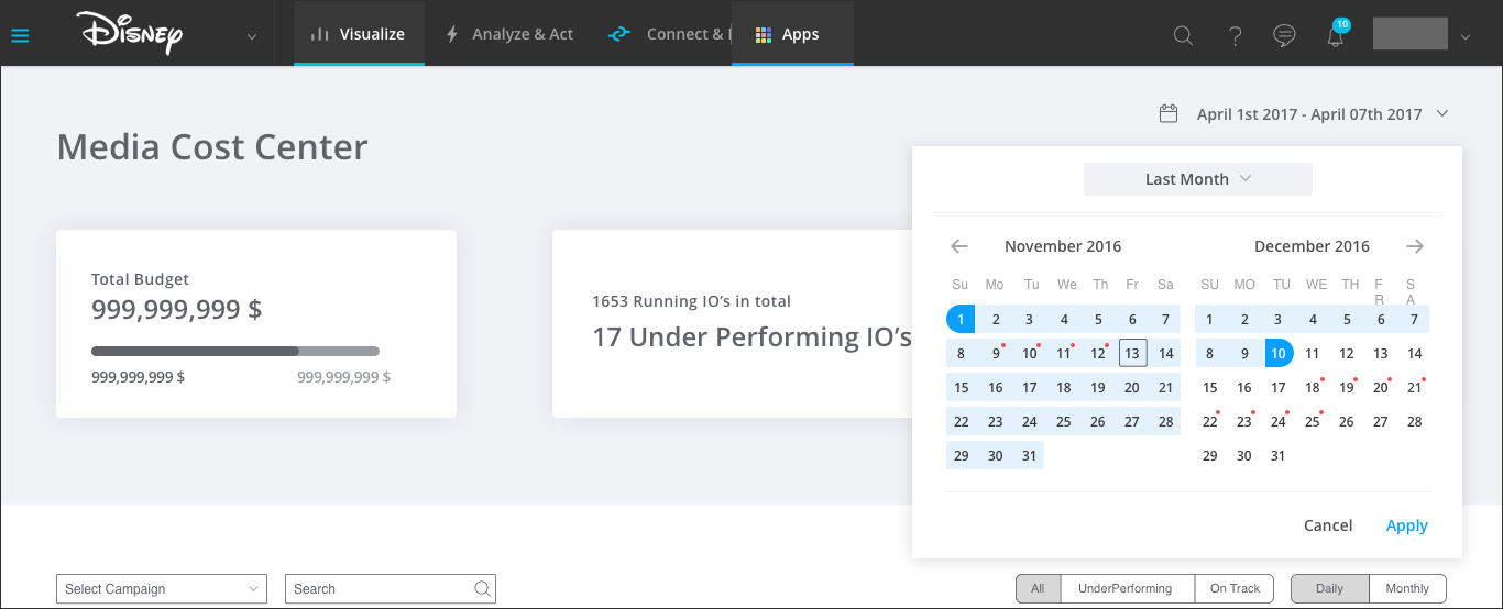
Will the date picker have any indication about the pacing that day?
How will we show our user he forgot to end a campaign?
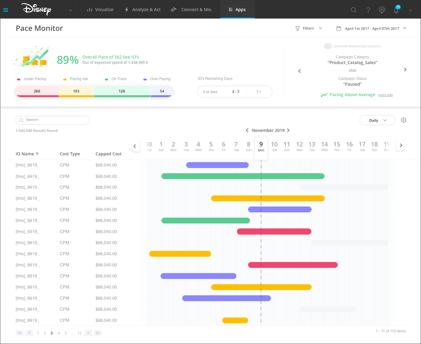
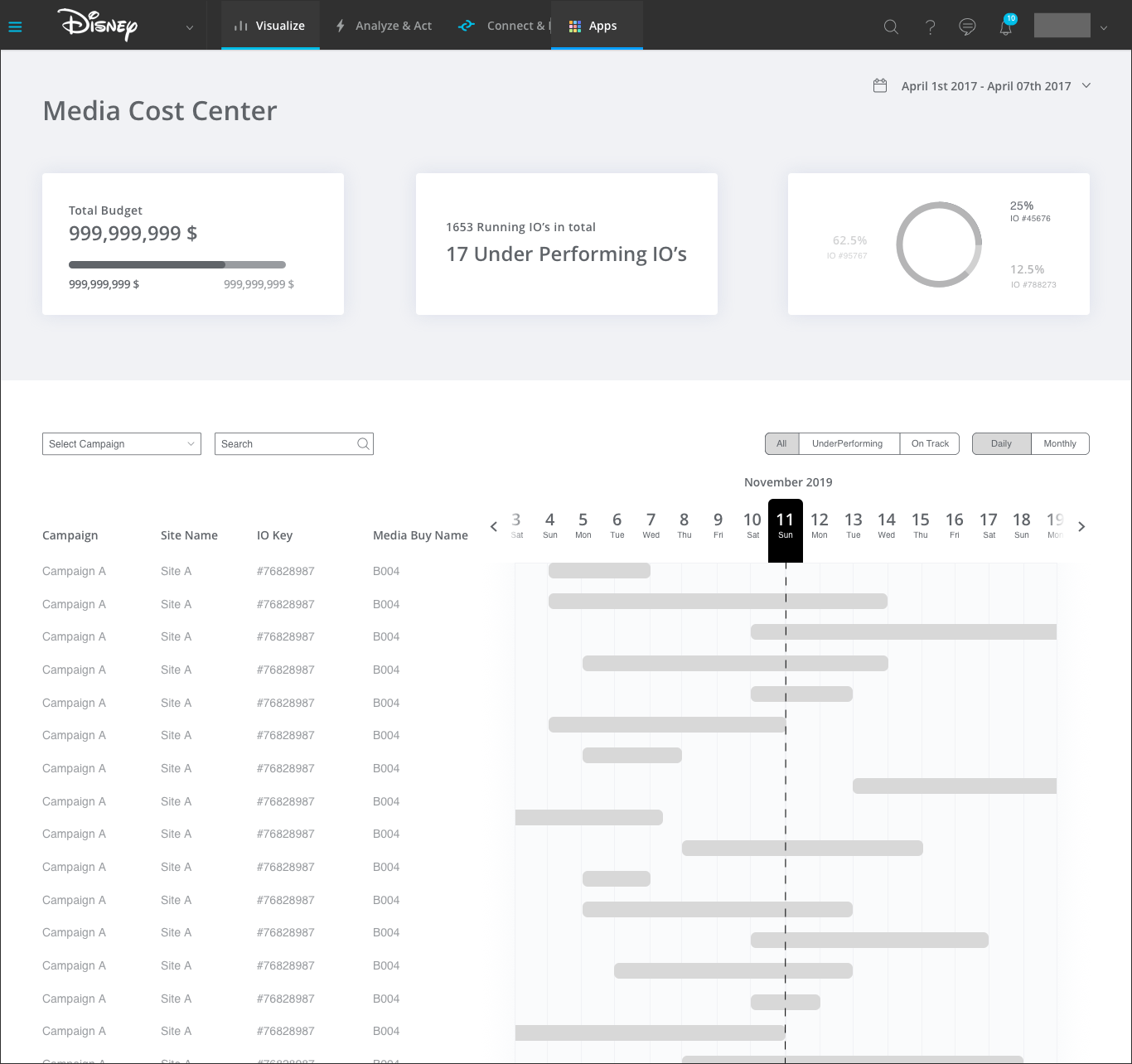
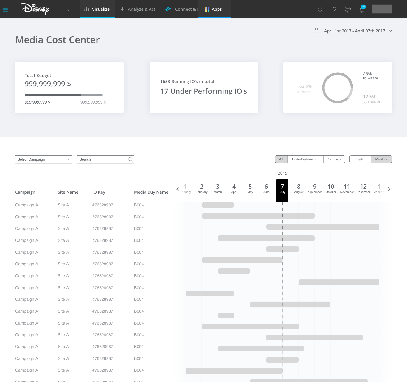
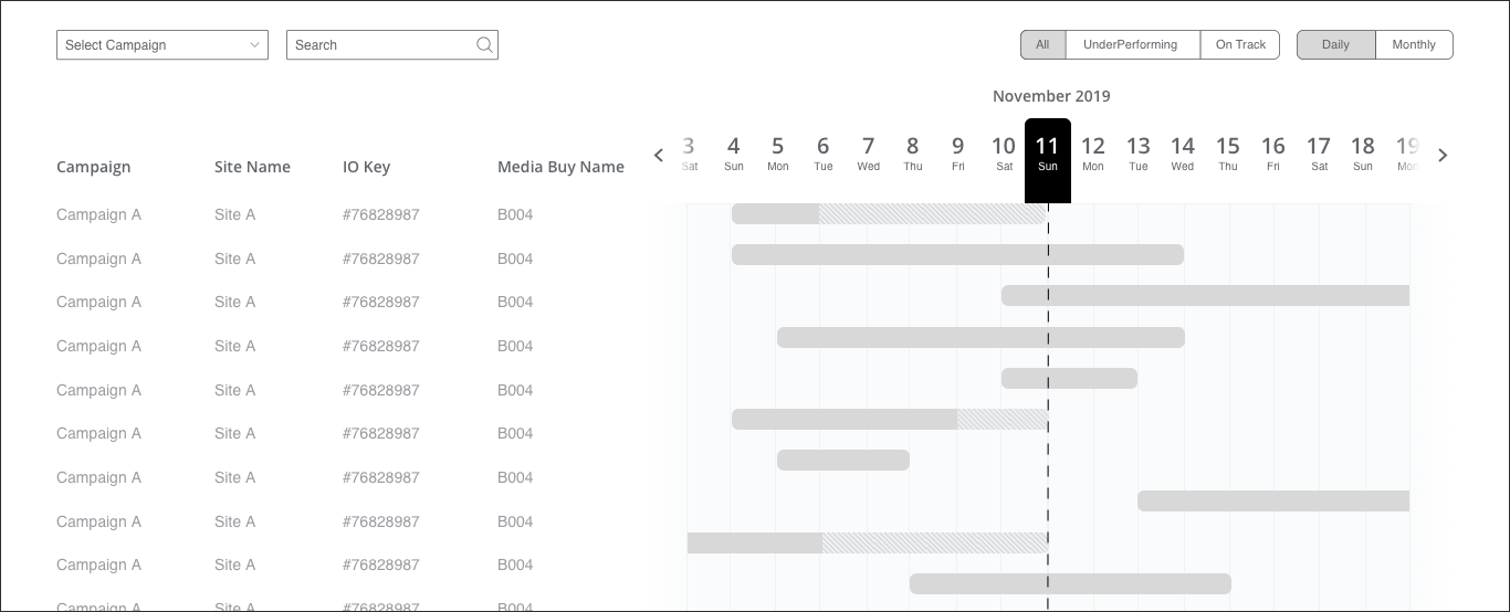
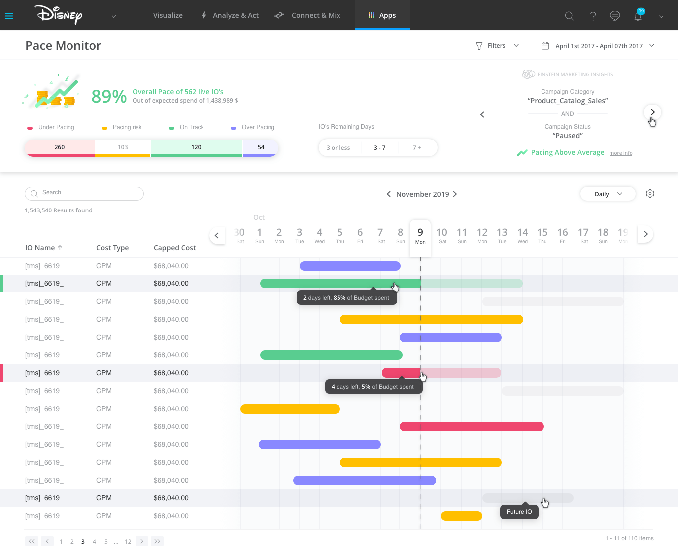
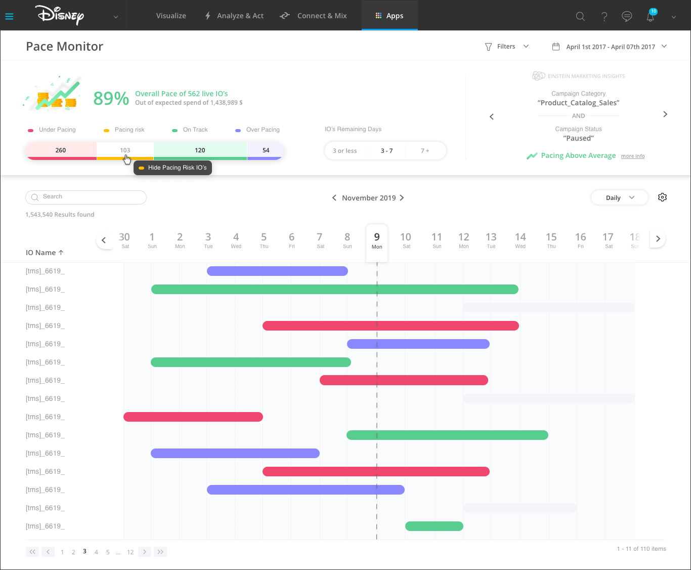
My final design includes:
1. Gantt view for all live IOs
2. Color code to indicate easily which IOs are under pacing, pacing risk, on track or over pacing.
3. Insights generator for better planning of future campaign budget.
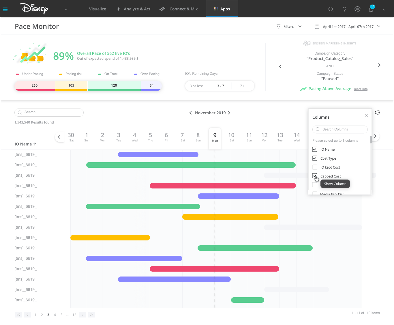
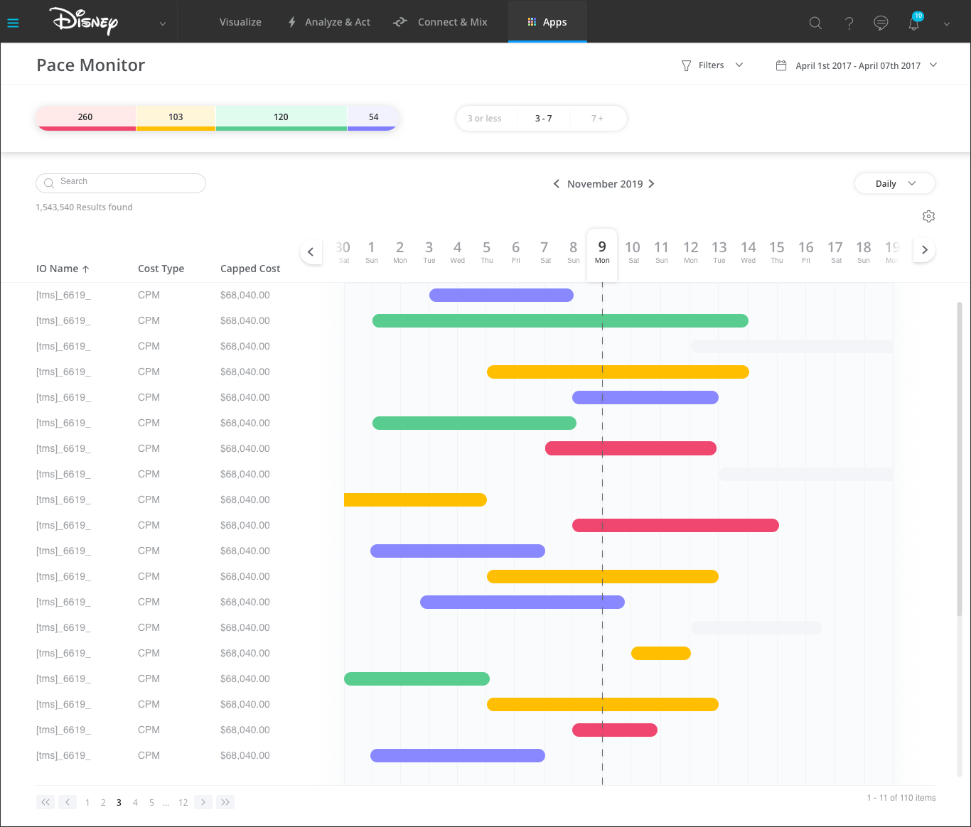
4. Filters and columns settings for easy access to the information the user is interested in.
5. The user can search for existing items to match a specific IO
Hover - How am I spending / pacing overall?
When clicking - Drilldown of a specific IO’s planned vs. actuals analysis and suggested actions
Example of How the user can filter the information:
The user can change the amount of info and columns that shows on the left:
Folded state when scrolling: