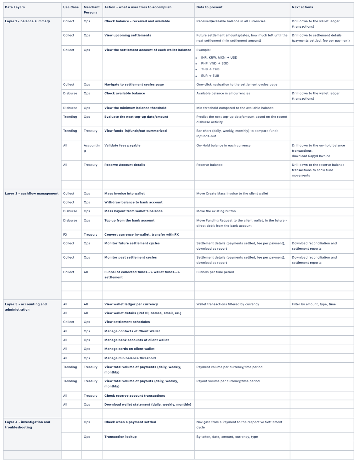
Research Conclusions
After interviewing our users, I came to the conclusion that when displaying client wallets, the focus should be on the funds in the wallet and their movement.
Information such as wallet token, wallet contacts or wallet financial instruments (banks, cards) will be accessed less frequently and mainly for maintenance or update purposes. With that in mind, the table below divides the data and actions in wallets into four layers: from the most frequently accessed/used (Layer 1) to the least accessed (Layer 4) and that led the UX design hierarchy.
Client wallet UX hierarchy:
I did the same for the group of users we call "User Wallets" (not relevant for the design shown in this project but was part of the same research).
Client Wallet Dashboard - UX design
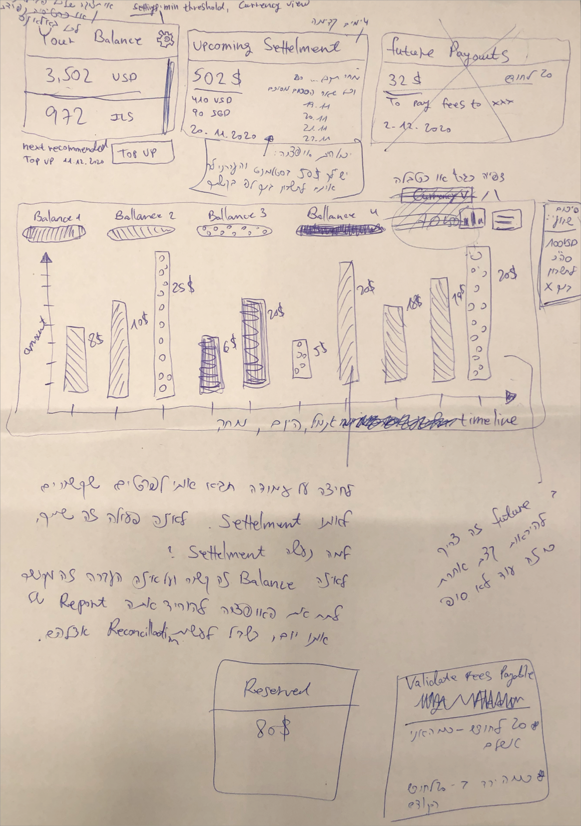
Taking the research conclusions into the UX design, I started designing the UX wireframes, for the client wallet dashboard.
I started with a very rough handwritten sketch:
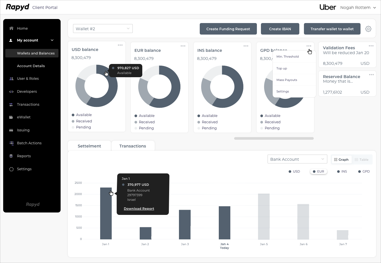
The next step was to make the transition to the computer and improve and clarify the design:
I kept improving and changing the UX wireframes consistently, until the product manager and I were sure all the information our users want and need is shown clearly in the dashboard design and the actions they would like to take, according to the research, are approachable and easy to use.
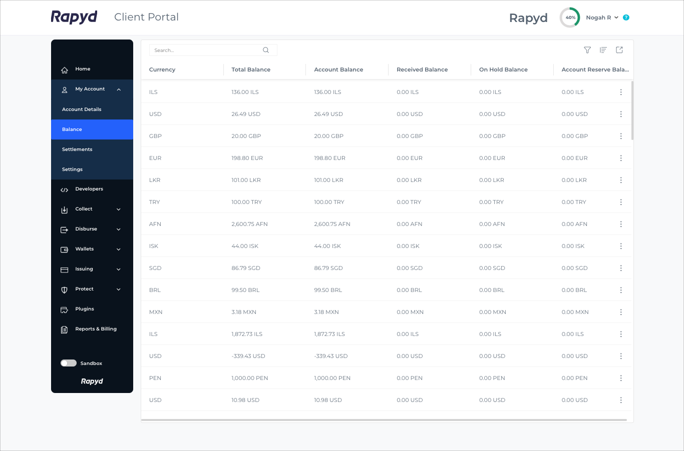
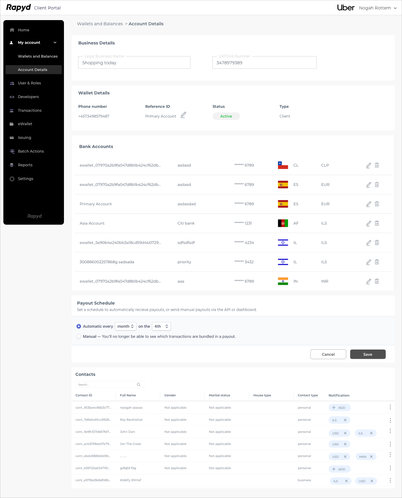
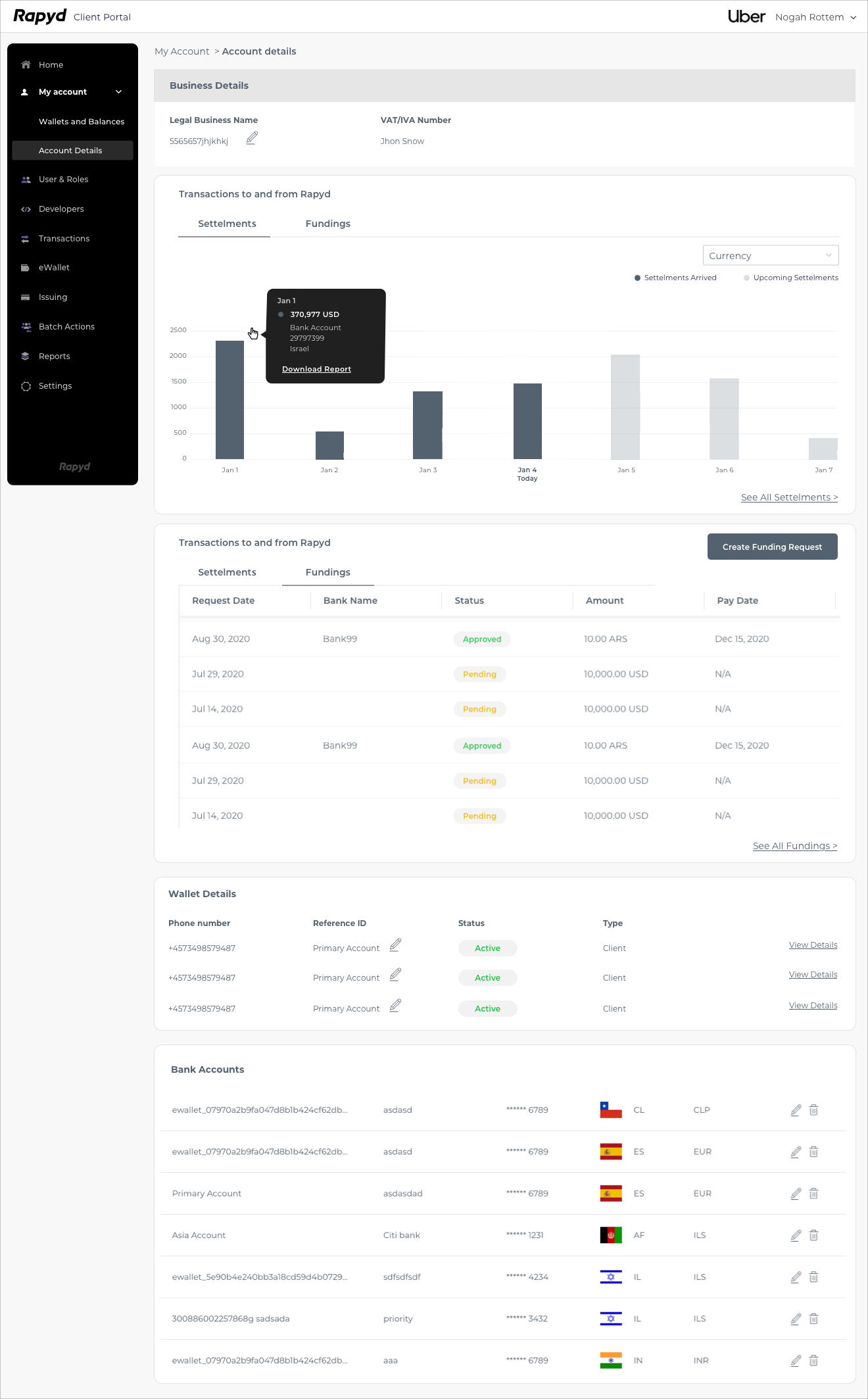
At some point we realized that we need to divide the page into two pages: one page with the main actions was called “Wallets and Balances” and the other “Account Details”, with more functional actions.
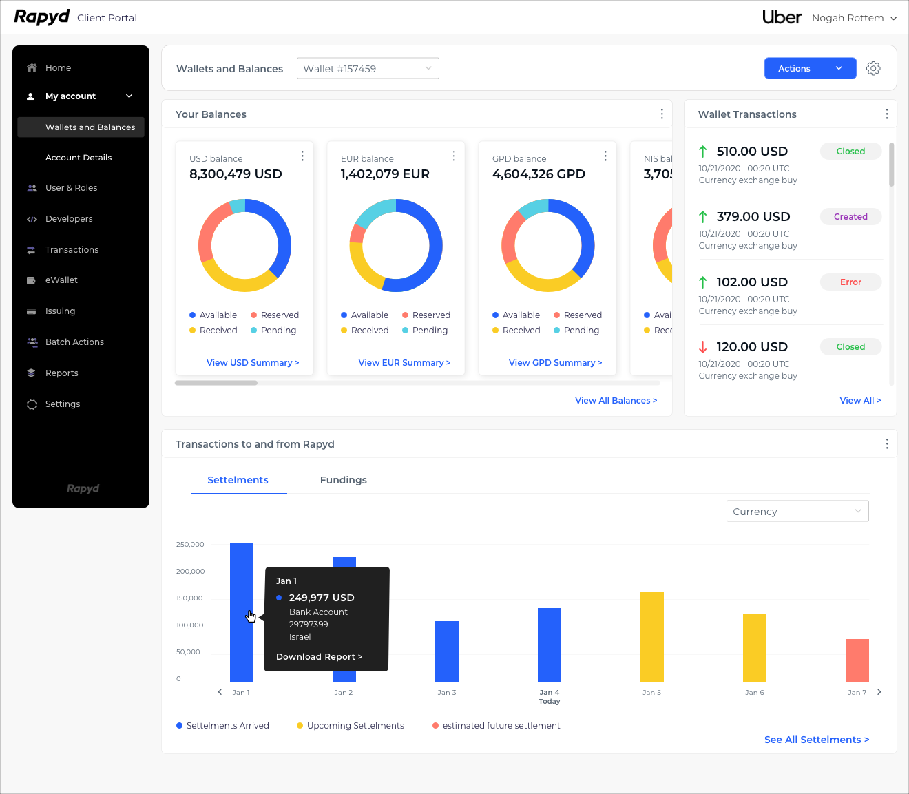
Wallets and Balances Page:
I kept working and improving the UX design by getting feedback from our users along the way and by asking their opinion and their thoughts. I wanted to make sure our users will have the best experience and intuitive flow.
Wallets and Balances Page - A more advanced version:
Account Details Page - A more advanced version:
The Final Design:
I kept changing the UX design, according to the discussions and feedback I received from our users.
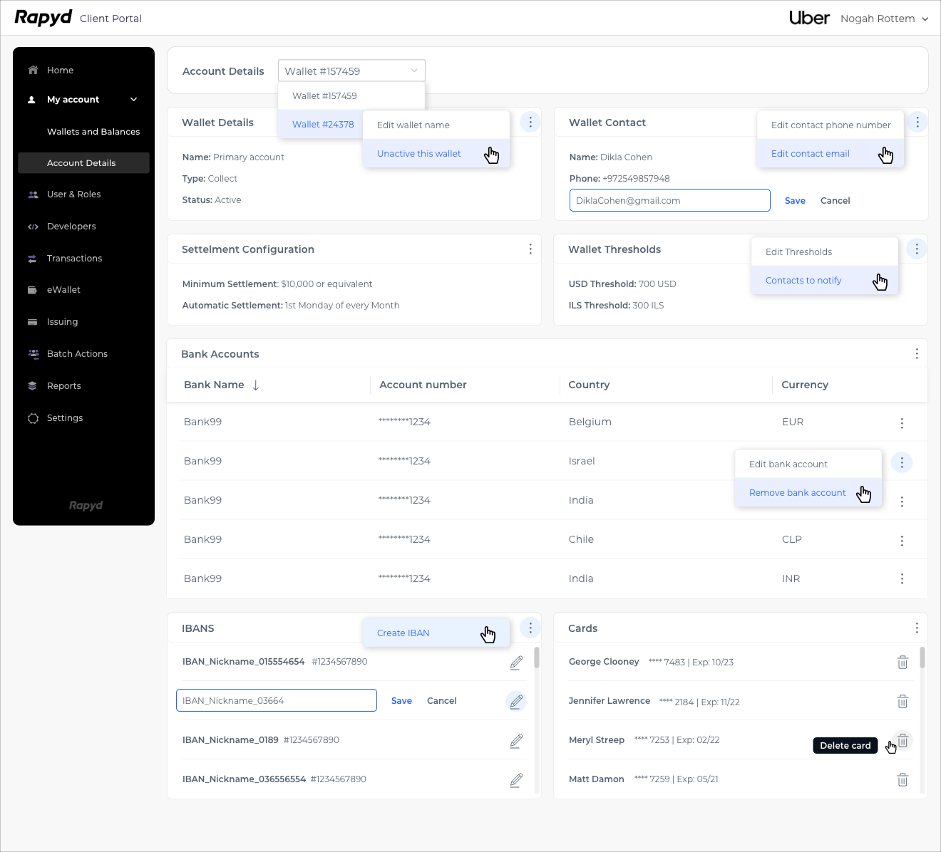
For example, you can see that the “Threshold” feature was placed originally in the main page - “Wallets and Balances” - but after my discussions with users, was replaced to the “Account Details” page because according to my research it is not a feature that is used frequently by our users.
“Wallet Details” and “Contact Details” were also replaced to the “Account Details” page for the same reason.
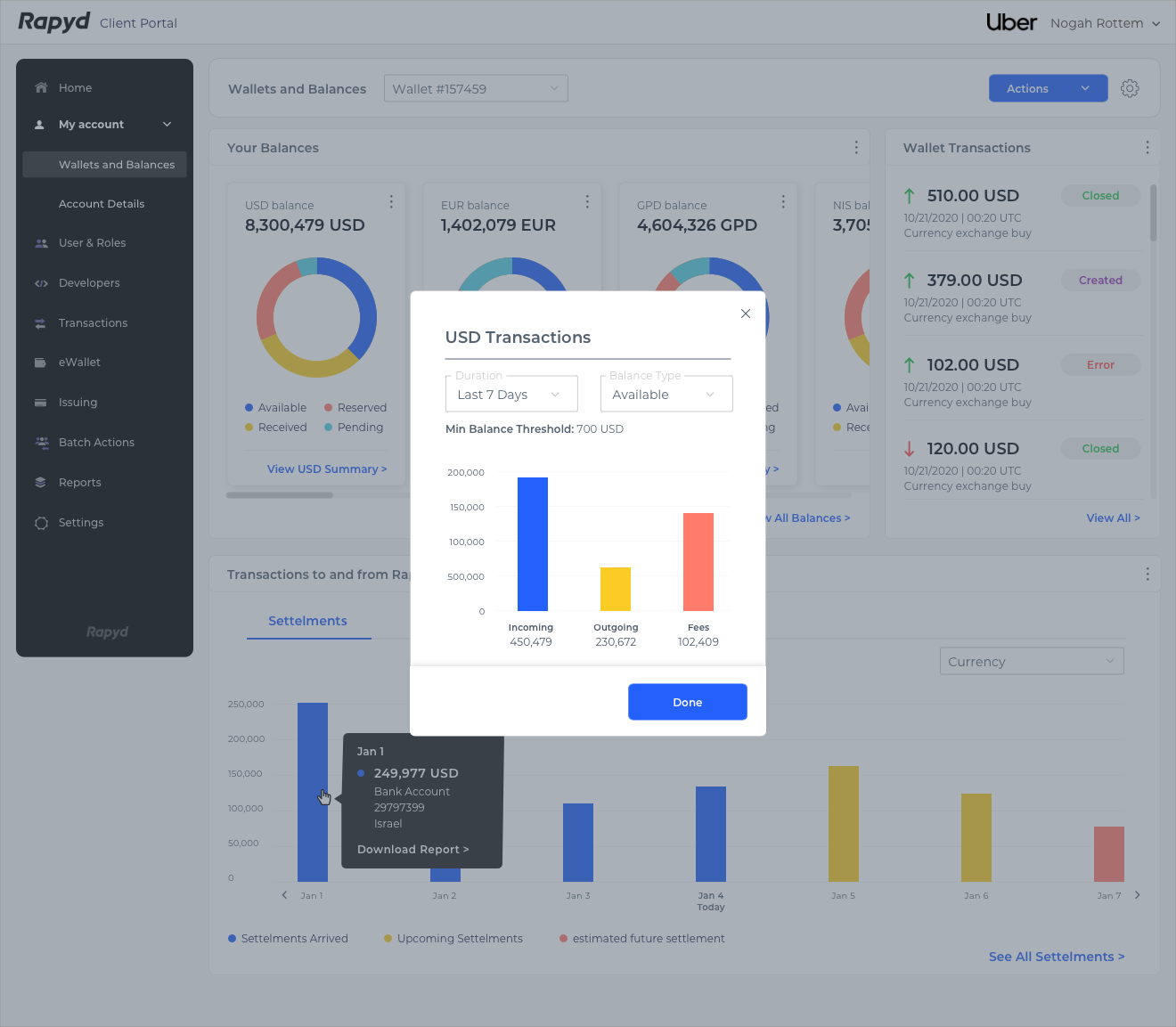
Also, after discussing with the users about their preferred kind of view, the “settlements” information was set to a graph kind of view and the “fundings” information as a table view.
The UI design was according to the new design system I implemented in the company.
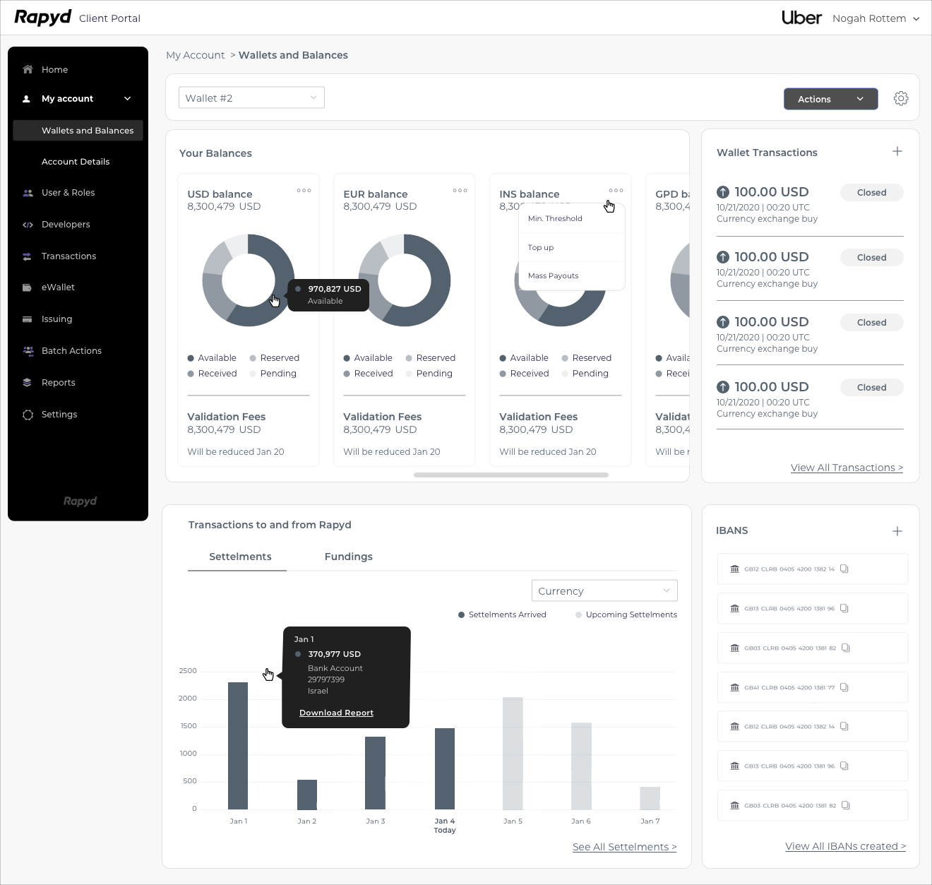
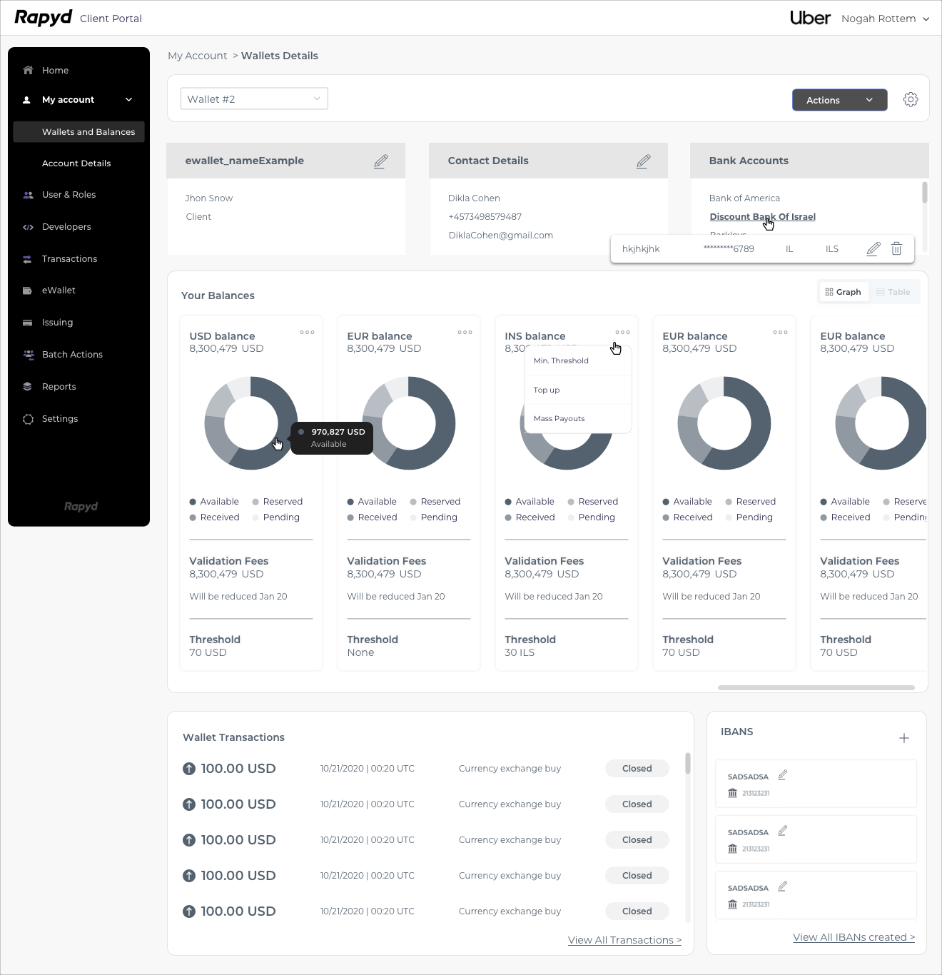
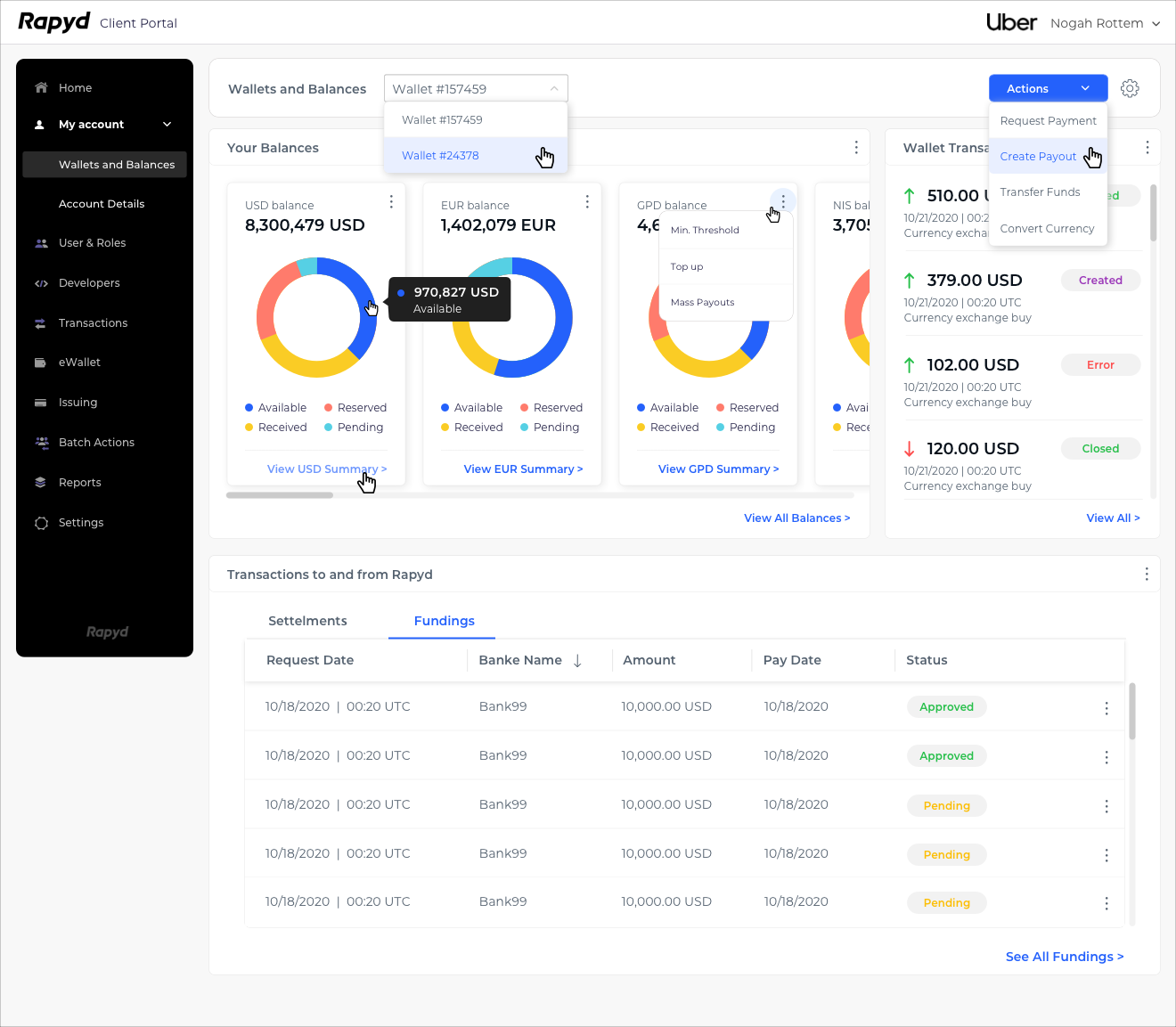
Wallets and Balances Page:
Wallets and Balances Page - Hovers state:
Wallets and Balances Page - view USD summary for example:
Result and Conclusions
Rapyd users were very excited and happy with the new design. They felt their voice and needs are heard and their user experience improved tremendously. They can now easily find the information they are looking for, make daily actions in a click or two, and see the data in an improved and a very accessible view.